Rebuilding a platform
MeUndies arrived on the scene as the first company with an underwear subscription. Their offbeat and often risqué marketing ads, podcast jingles, and social presence was catching people's attention, but their subscription offering and brand identity was not keeping up. Cracks were starting to show as their presence grew and if their subscription service didn't evolve, supply, scaling and branding concerns were bound to cause serious issues for the emerging startup.
I was hired as MeUndies first product designer & art director to help lead efforts in revamping their entire subscription service and identity.
😮💨
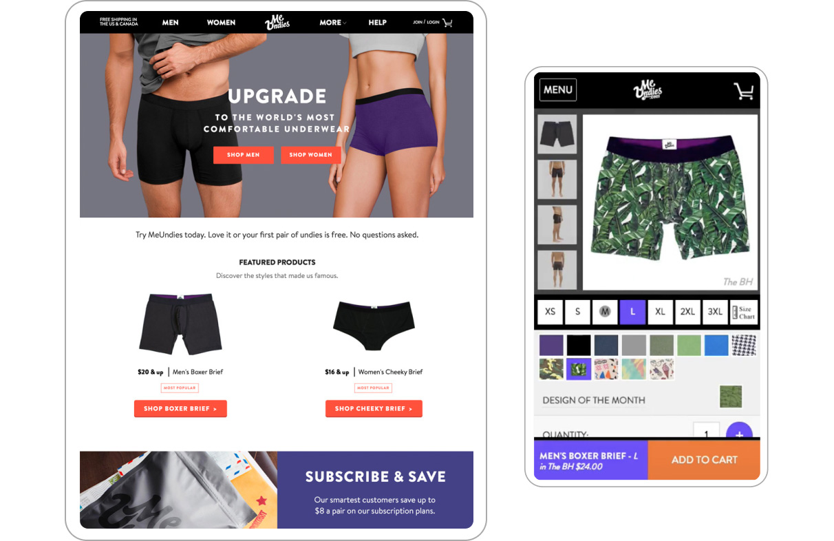
What year is this?
Some background
In a few short years, the MeUndies subscription service had grown and become a reliable and main source of income for the company. However there were some major issues in how the service was being run internally and for customers. Interaction design, digital product, and art direction was also in need of a dire upgrade.
But we first had to fully understand what the pitfalls of subscription were. We began by conducting interviews with leadership, engineering, cx, and the analytics team, and in doing so we discovered some alarming insights.
The existing model
was not sustainable
The subscription service, labeled "Design of the Month," meant customers would get 1 newly designed undie print delivered each month. The week prior to shipment, this unique design would be revealed to all customers via email and marketing. Users could then decide to skip their month if they didn’t like the pair or they could cancel their subscription. If they enjoyed the pair, no action was needed and their pair would ship.
Simple in theory, however in practice, having one unique print per month:
(a) Meant an immense amount of pressure on the company to order the perfect amount of inventory.
(b) It made it almost impossible to forecast popular design trends (keep in mind, it takes about 6 months to design and wait for product to arrive).
(c) Excess inventory was almost guaranteed if too many users skipped or cancelled their subscription.
(d ) Last and worst of all, too little inventory meant no product for subscribers. And yes, that happened a few times.
Our team
was too lean
A new, unique design releasing monthly meant pressure on an already lean creative and dev team to launch fresh campaigns every month that included videos, photoshoots, influencer marketing on top of creating assets for digital marketing and web. Our whole company at the time was ~20 people total. Many established companies have issues launching 1 or 2 full campaigns per year. MeUndies was running 1 to 2 every month and there wasn't a guarantee that any print would be a hit.
Subscribers were
getting annoyed.
Our customer experience team received daily emails and calls expressing their disappointment with the service. Not to say that people weren't entirely unhappy. Those that weren't wanted more options and had gone months skipping pairs and would ultimately cancel. New subscribers also didn't like the fact that they had to purchase a new pair at full price then wait until the following month for their subscription to begin at a discounted rate.
The backend
code was messy
The backend subscription platform was incredibly scrappy though it did work. Orders were processed through a custom built system however much of it was done manually. Every month prior to launch, we would gather around a computer, grimace a bit and close our eyes as the lead engineer pressed the magic button to process orders, emails, and shipping labels for thousands of subscribers. It was stressful but at the same time exhilirating knowing it could break at any second. Startup life I suppose but fun nontheless.
So before tackling the hurdles of UX, interaction design, user testing, branding and identity, we needed to solve some major product issues and figure out strategy. This was going to be our first major test.
The existing
subscriber journey
Simple but unsustainable.

Change is tough
One of the main questions we asked when thinking of how to solve for subscription was pretty straightforward:
"Why do we have a subscription service?"
Despite all efforts, data showed that MeUndies best selling pair at any given month was a black boxer brief which wasn't even available through subscription. The question was valid though, and it gave us a starting point. Often times we need a reminder of why we do things to challenge us from feelings of complacency. Luckily, we weren't starting from scratch but at the same time we kind of were. The team and our customers provided some solid insights.
“
MeUndies is known
for subscription.”
Subscription had become integral to the brand and gave users a reason for returning.
“
Subscribers are our
best customers.”
Subscribers were the most loyal type of customer. They had the highest aov (average order value) and ltv (lifetime value), were most likely to recommend MeUndies to a friend or family member, and were by far the most active on social media.
“
It's a relatively
safe bet.”
And it was. Subscription kept the lights on and afforded us buy even more lights. Even the fancy smart LED ones.
“
It’s just an enjoyable thing for me to do.”
We loved our customers and we wanted them to have a great experience buying our undies as much as they loved receiving them.
We took this info and distilled them down to 4 growth points that became the source of truth for team alignment.
Solidify the brand
Grow & retain loyalty
Scale responsibly
Provide joy
The elephant in the office
It was no secret that we had a big problem at hand. The warehouse was getting full, new inventory kept arriving, and the product display page was becoming bloated. Word around the startup space was subscription service, Loot Crate, was also having similar issues and things were beginning to fold.
Collaborating with the Creative Director and Product Manager, we began designing a new experience that would alleviate major issues based on our critical insights.
The plan involved multiple steps that would need to work in tandem in order for it to succeed.
Distribute shipping
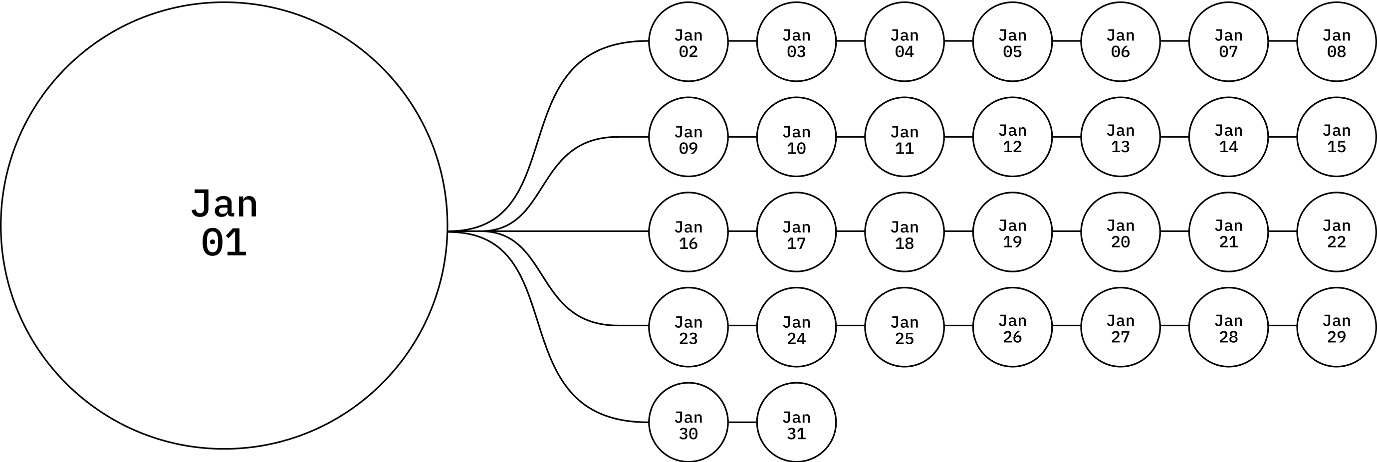
Aside from all of the inventory issues, shipping tons of product at the first of every month was a logistical nightmare that would only keep growing. The new plan was to distribute subscription orders every day alleviating the pressure of 1 days worth of shipping now being spread across 30 days. Of course, this setup would bring in some other logistical issues that would need solving but it overwhelmingly decreased bloat and stress.
Rethink Strategy
Seasonal > Monthly
With a new 30 day shipping schedule, it was clear that "Design of the Month" had to go. Instead, we were going to design multiple prints that's we would design and release seasonally as well as for unique occasions or campaigns.
Yes, I know that sounds crazy; “let's create even more designs versus just the one each month.” However, this approach would allow us to order undies in smaller quantities and at shorter intervals as well as give users more options in case they didn’t like a particular design. Our team was also really quick at creating designs.
Additionally, we would also be able test what type of prints do well and create scarcity if one sells out. If a print proved popular enough we could always reorder another batch vs the exclusivity of the current model.
Lastly, we would not need to create campaigns and marketing collateral for every print. We made ourselves too self-important in that regard and could finally dictate our own schedules. Stress could be alleviated for creative, dev, and marketing so we could now focus on promoting the brand and optimizing the product.
Create new plans
We knew it was important to not overwhelm customers with a complicated subscription experience. The one nice thing about "Design of the Month" is that it was clear and understandable. So, the goal was to create 3 simple membership options with built in features that would give new and existing customers more control.
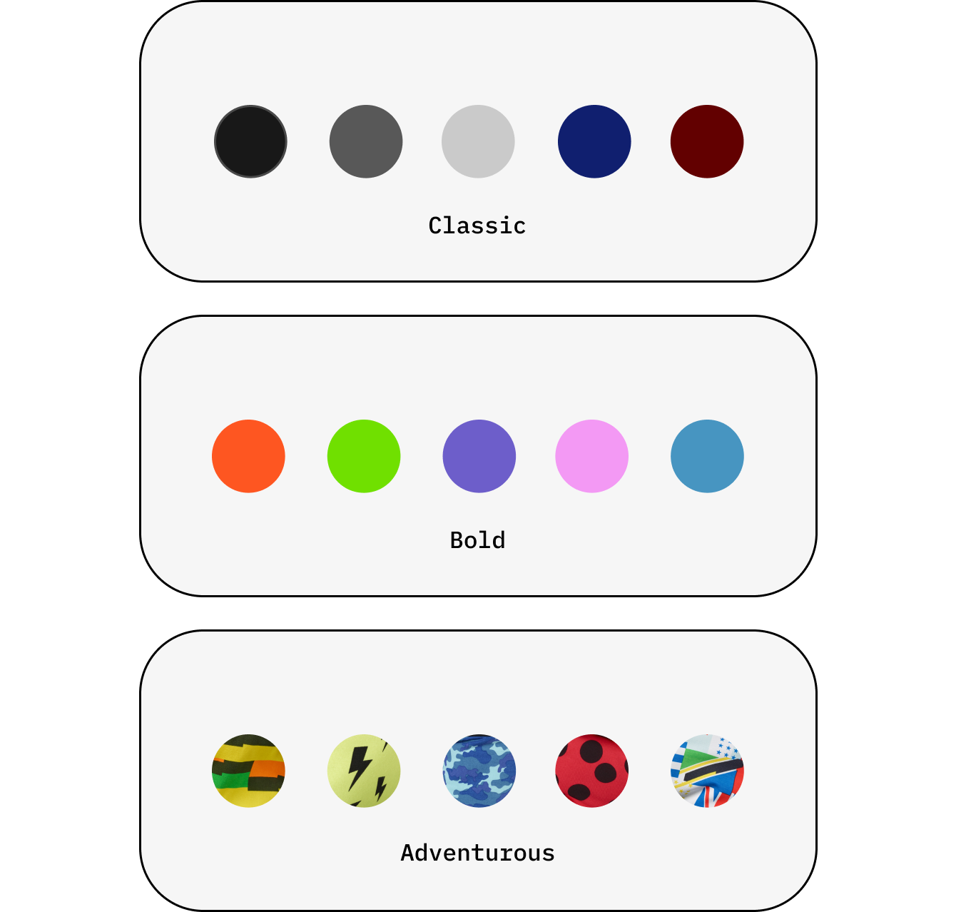
The 3 new plans were:
i. Classic: neutral dark tones like black and navy.
ii. Bold: bright and solid colors.
iii. Adventurous: All new prints
Users would now be able to switch plans as well as swap and reserve pairs versus just being allowed to skip. All existing subscribers would automatically be enrolled in the Adventurous plan so essentially the transition experience would be seamless.
(Re)build and iterate
With such big changes on the horizon, our engineering team would need to rebuild the entire subscription structure, create new algorithms, transition existing users to their new plan, and automate launches on the backend. No easy task.
From a digital product and creative perspective, our goal would be to rebrand subscription to a membership service, inform users of the upcoming changes, define new touch points where users can sign up and manage their plan while keeping the entire experience enjoyable.

It was (not) happening (yet)
Once we had a solid strategy, the idea was presented to the owner and CEO. Little did we know, they were going to need a lot more convincing. This was a major change to a service they created and grew from the ground up so we needed to mitigate risk at all levels.
Working with our product manager, we were able to work out a strategic plan on how to rollout the new subscription service in phases that would allow us to test and iterate.
Phase 1
Inform customers of upcoming changes
Launch rebrand with membership options
Phase 2
Build a new membership flow
Build a membership dashboard
Phase 3
Replace Design of the Month
Migrate customers to new shipping algorithm
The Fun Begins
Phase 1 was the most exciting part of the project. We had cart blanche to redesign some of the dated visuals and UX practices on the site as well as implement new UI and MVP features that we could test and iterate on.
Because users could only subscribe through the PDP page, it made sense to focus most of our early attention there.
Since I was also an art director on the project, I worked closely with the Creative Director on how products and models would be shot and featured on the site. Check out how the rebrand went here.
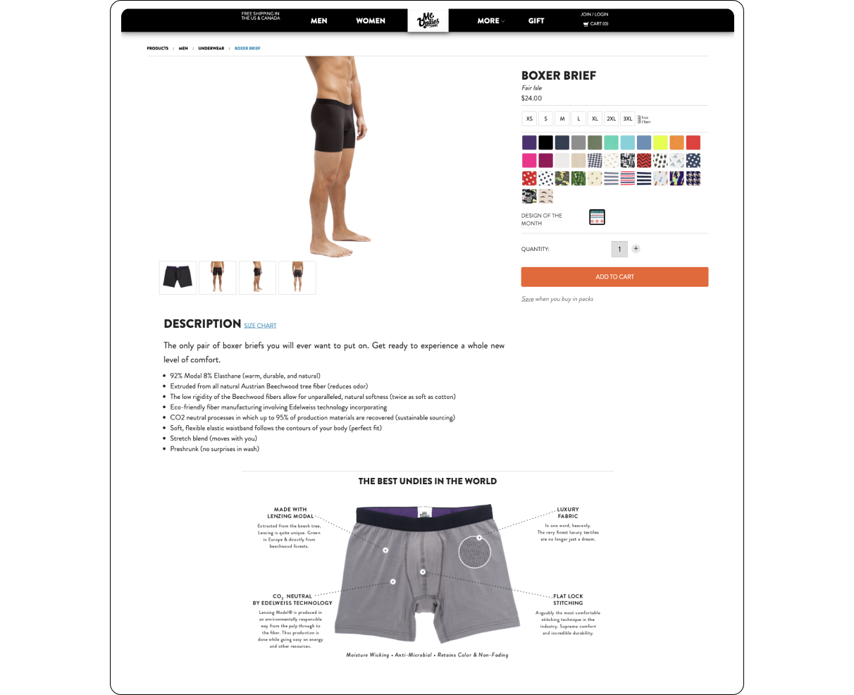
Existing Product Display Page
Wait, how do I subscribe?
By far, the lowest hanging fruit in optimizing and revamping subscription (soon to be membership) was making it clear how to subscribe and informing users how it worked.
The current page only utilized a tooltip that worked on hover but never made it clear to users how to subscribe. By selecting the Design of the Month print, a “Subscribe + Save” module would kind of magically appear explaining the process. It was a little wild the way it worked but that was the only way in.

The Magic Hidden Module
Our MVP
To test our new subscription plans and optimize the only entry to becoming a member, I redesigned the purchase component with a few optimizations that would become our control for testing later on. It took a cleaner approach separating classic, bold, and adventurous plans and the Magic Hidden Module was now permanently visible.
One controversial change was removing the quantity selector. The problem was users would often add multiple subscriptions in one session accidentally, and the backend logic was not there to separate number of subscriptions therefore making it unclear what users were signing up for. Because data showed that users were more likely to buy different color singular pairs vs two or more of the same pairs at once, unless buying a pack (a separate buying experience), then it made sense to mitigate the risk of accidental multiple subscriptions until there was a solve.
The redesigned MVP purchase component would later go on to heavy a/b testing for ultimate optimization.
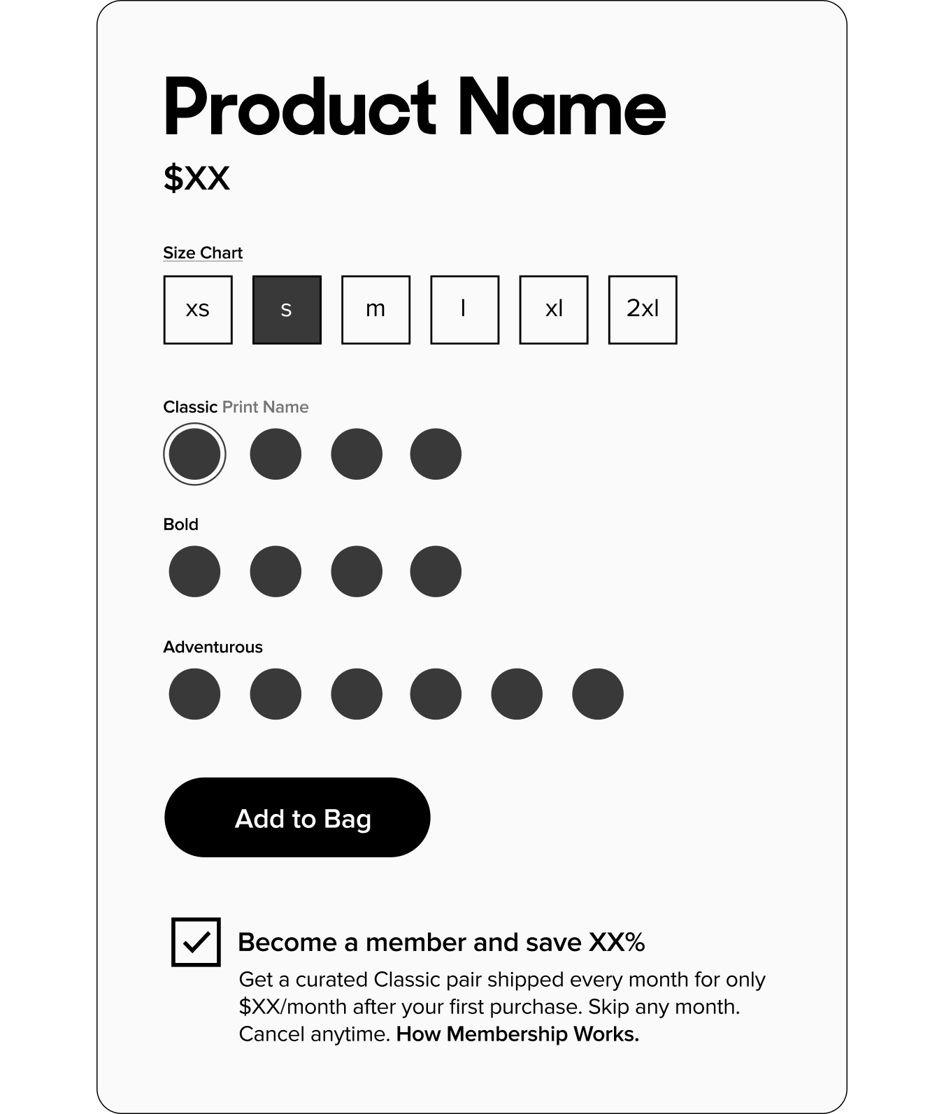
Redesigned MVP purchase component
3 birds 1 stone
Before

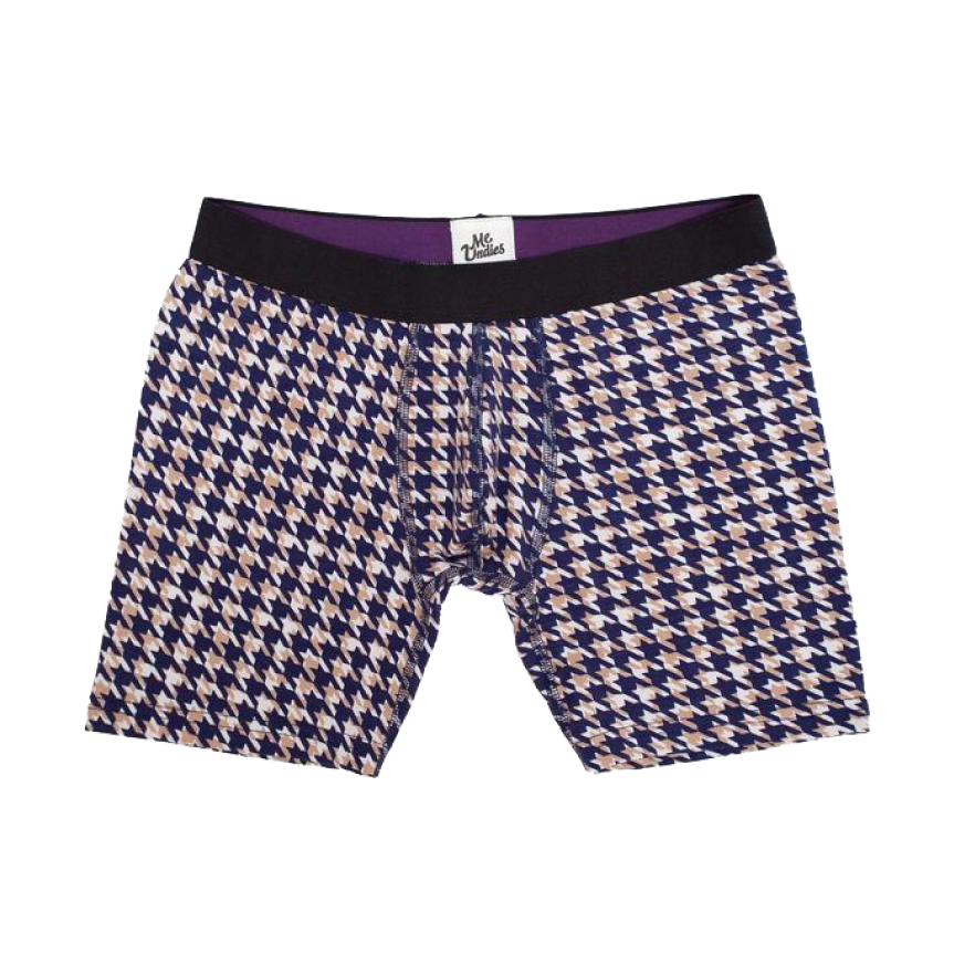

After

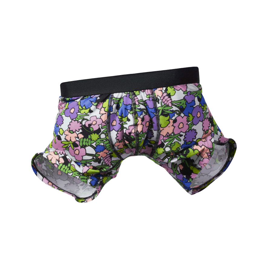

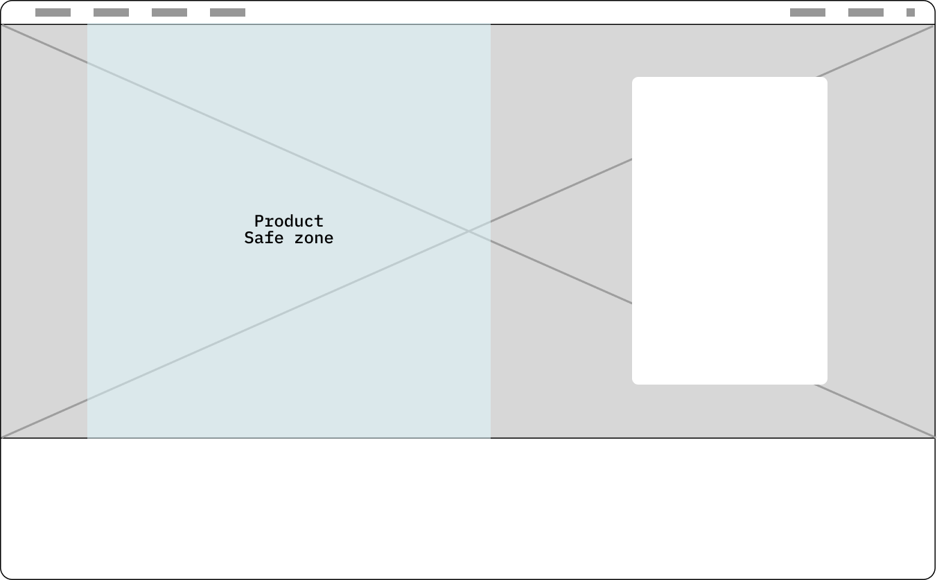
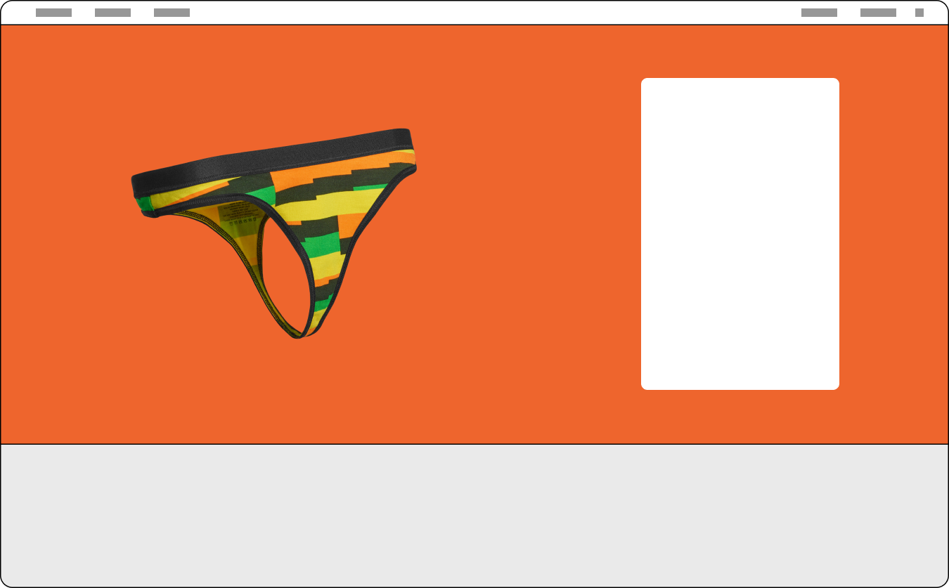
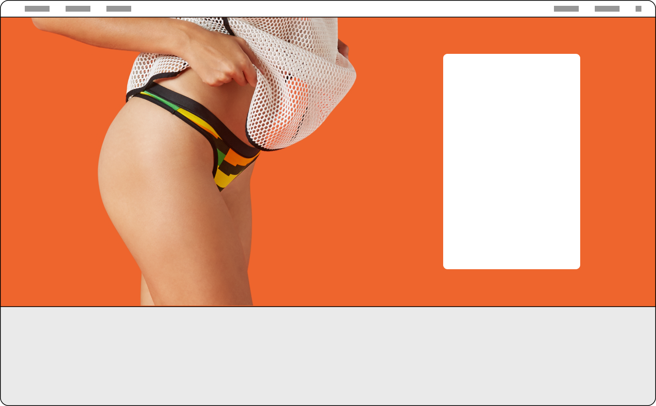
Sidestepping a bit, the new branding was turning out great and was very unique compared to what other brands were doing. So when working on the PDP page, I had to make sure that updates featured the new photography and branding in a way where it felt cohesive and dynamic while making sure it was mobile responsive.
Since I knew all product was being masked onto a transparent background and lifestyle shots bled onto solid colors, I devised a solution that would allow us to choose photography templates and change background HEX colors to match.
Photography template 01
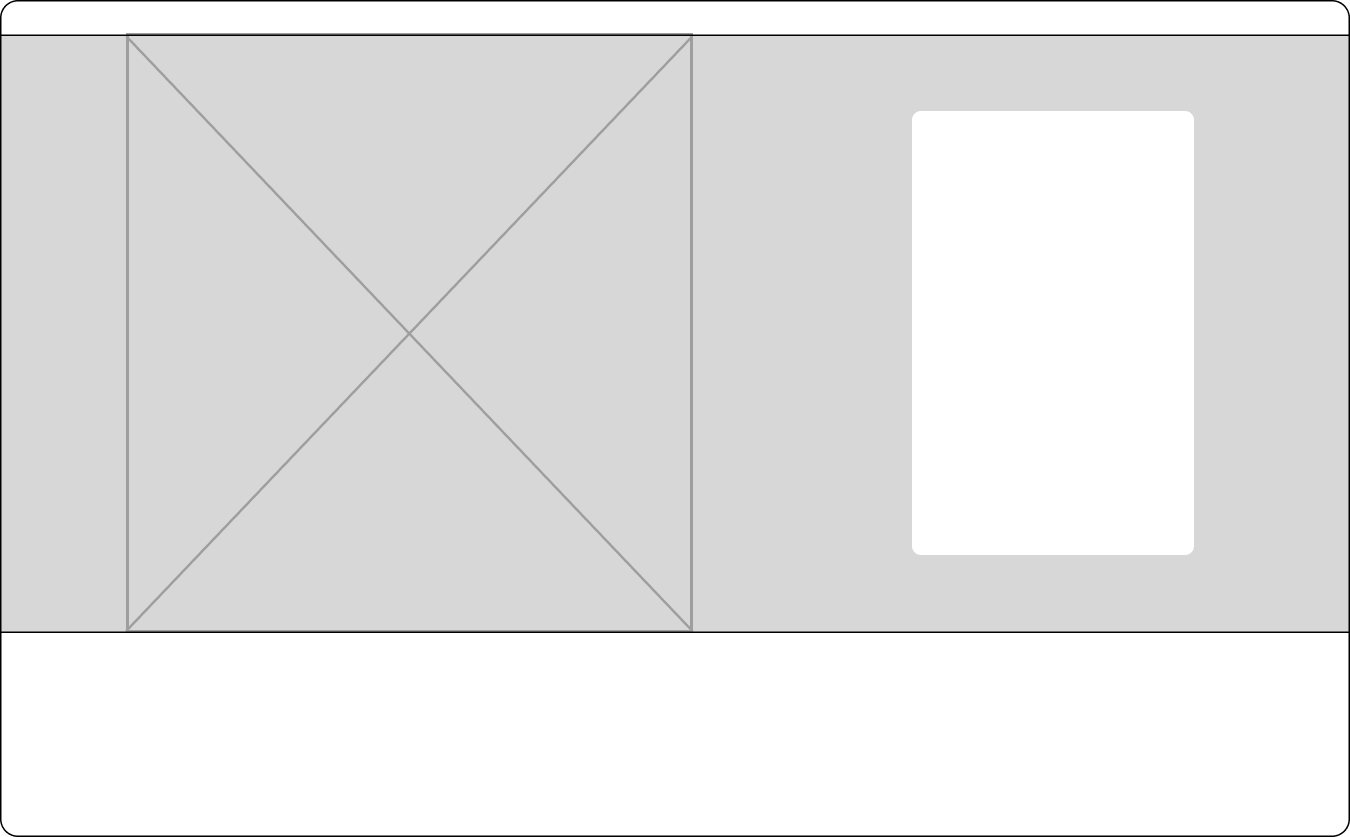
Photography template 02
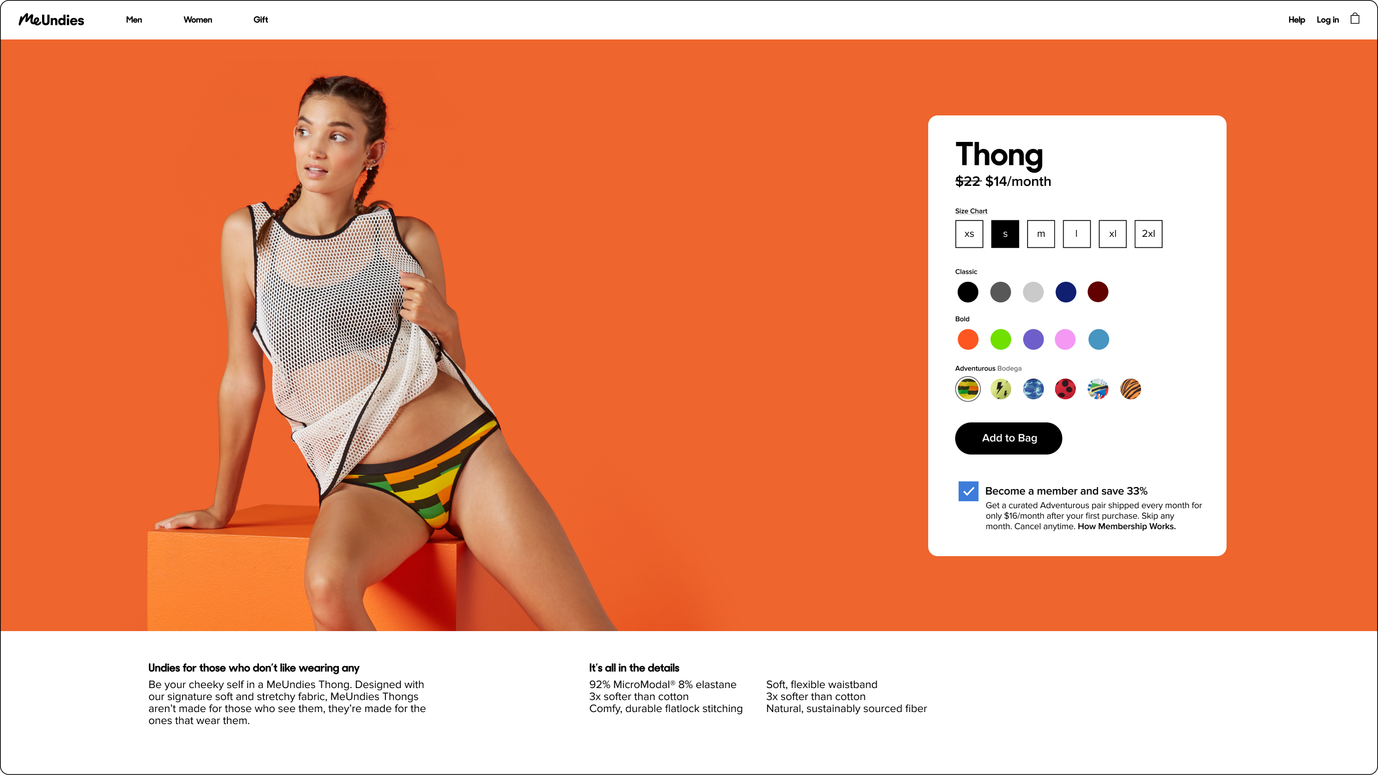
Combined with the new purchase component, things were really coming together.
A new platform
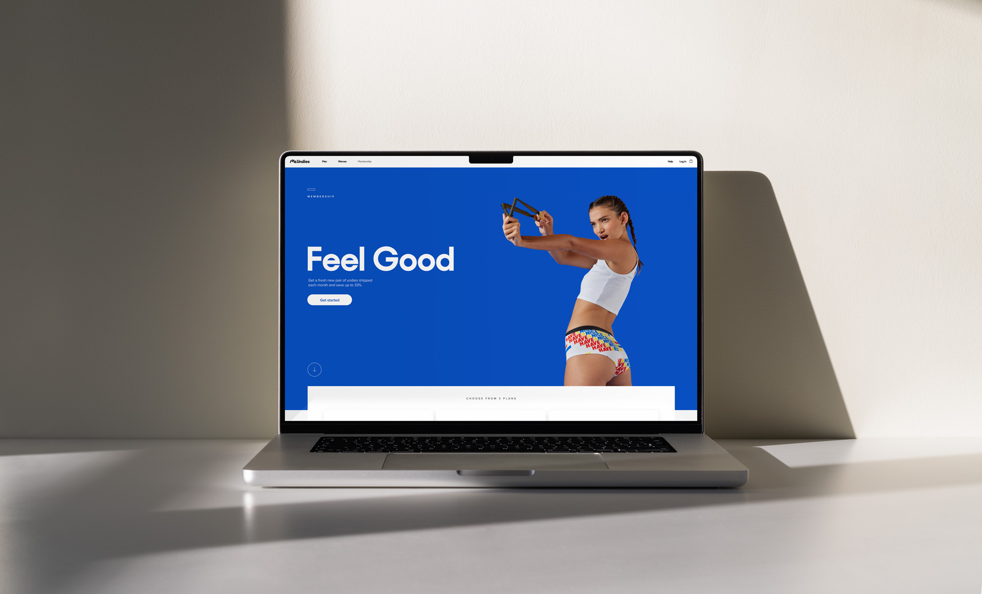
Phase 1 was complete and launched. The site had a new look & feel and customers now had more options when it came to membership. The feedback was overwhelmingly positive and we started seeing a nice uptick in press and memberships as well.
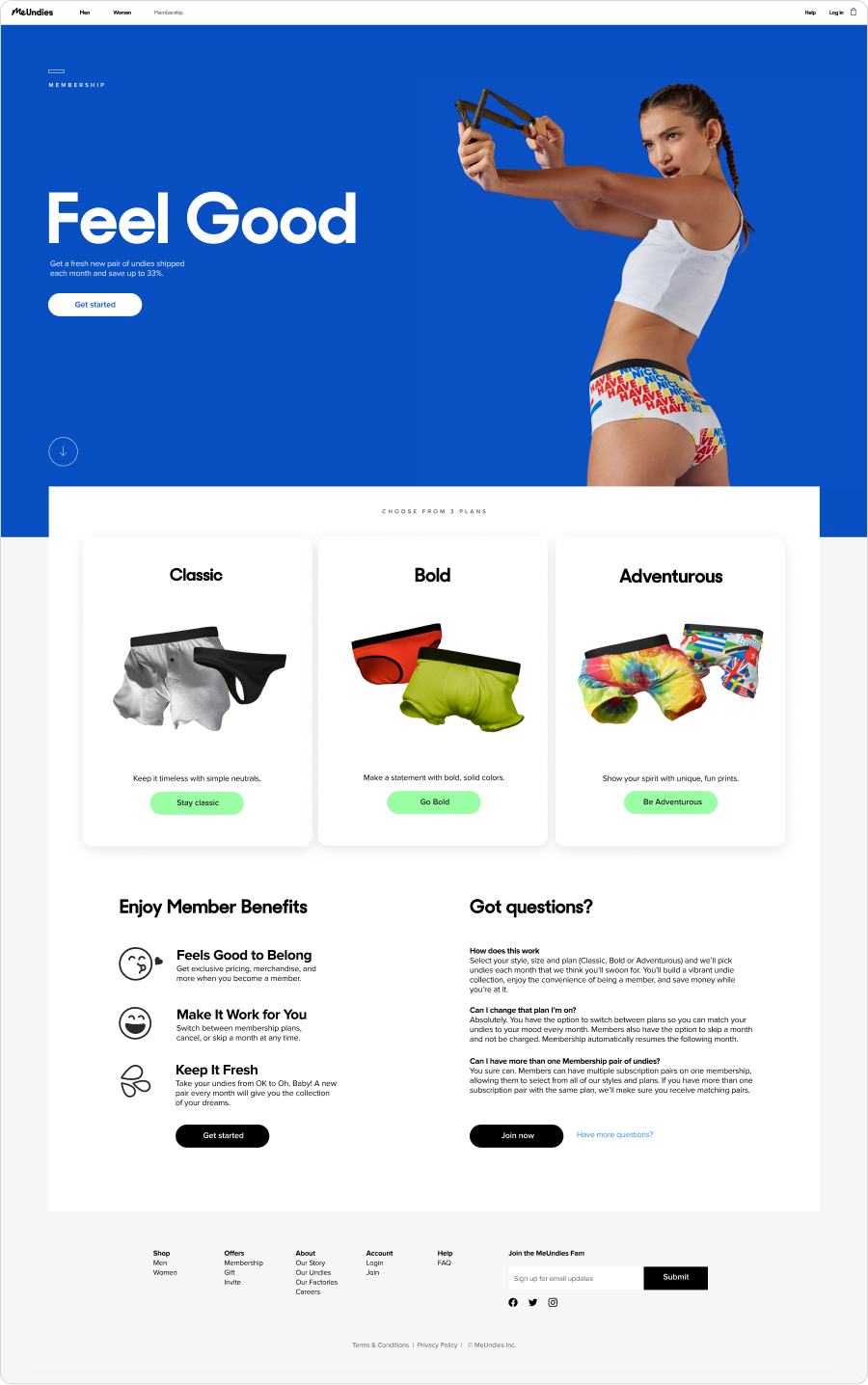
As we built out our component library and design system, we now had a chance to create a dedicated membership page explaining the program along with a guided flow.
Non-Logged in User Flow

The landing page was built with multiple entries to join, an explanation of benefits and a short faq section.
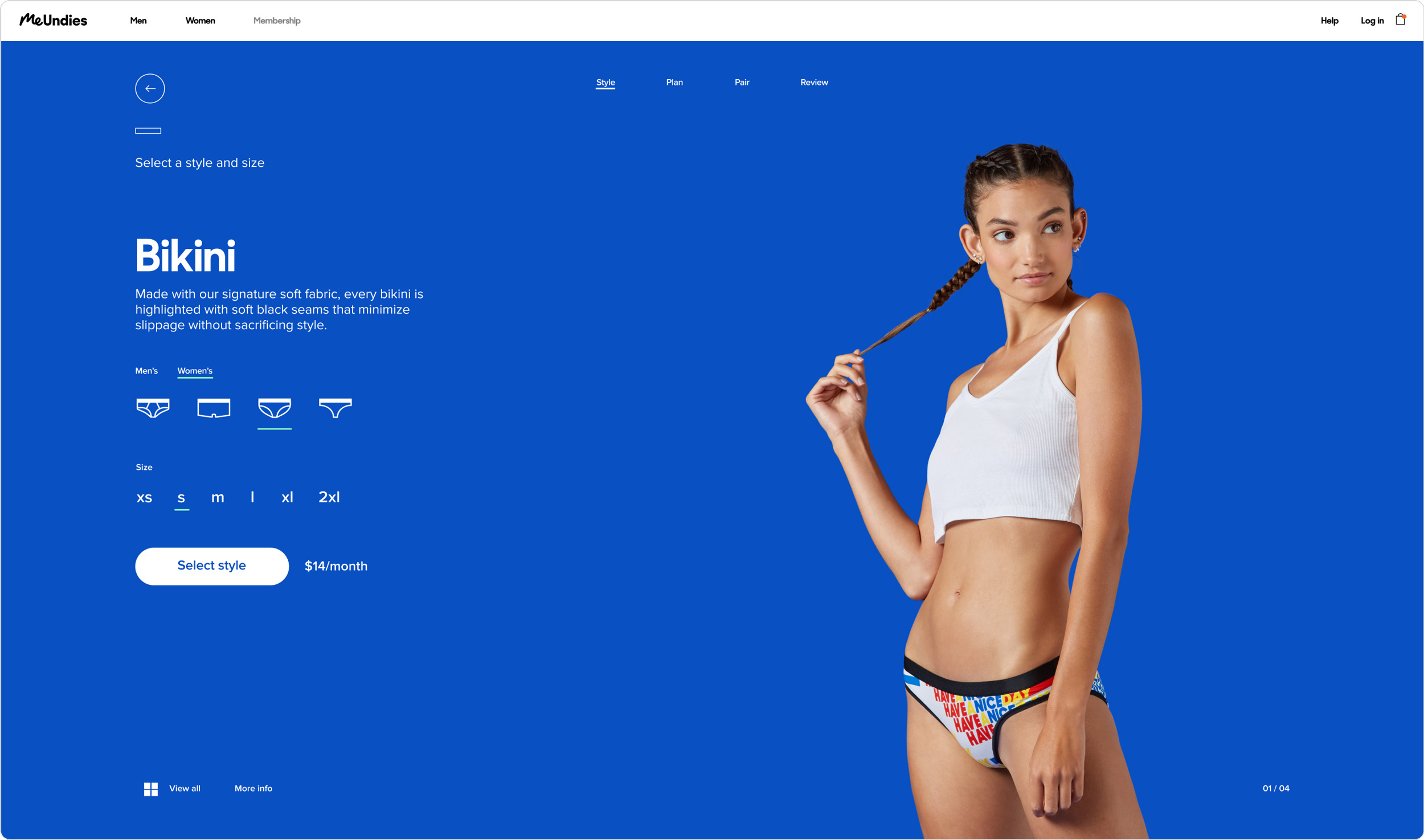

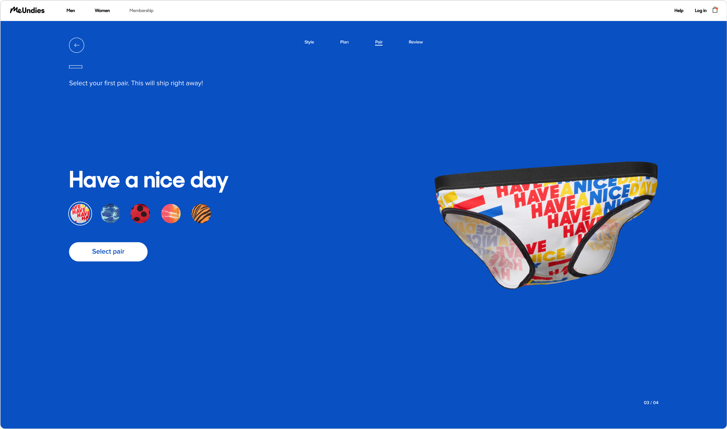
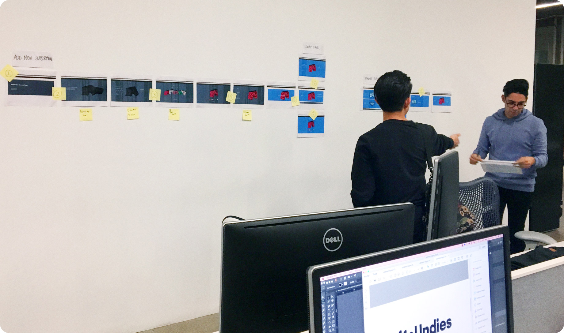
Working with engineering team (Sung and Justin) on early stages.
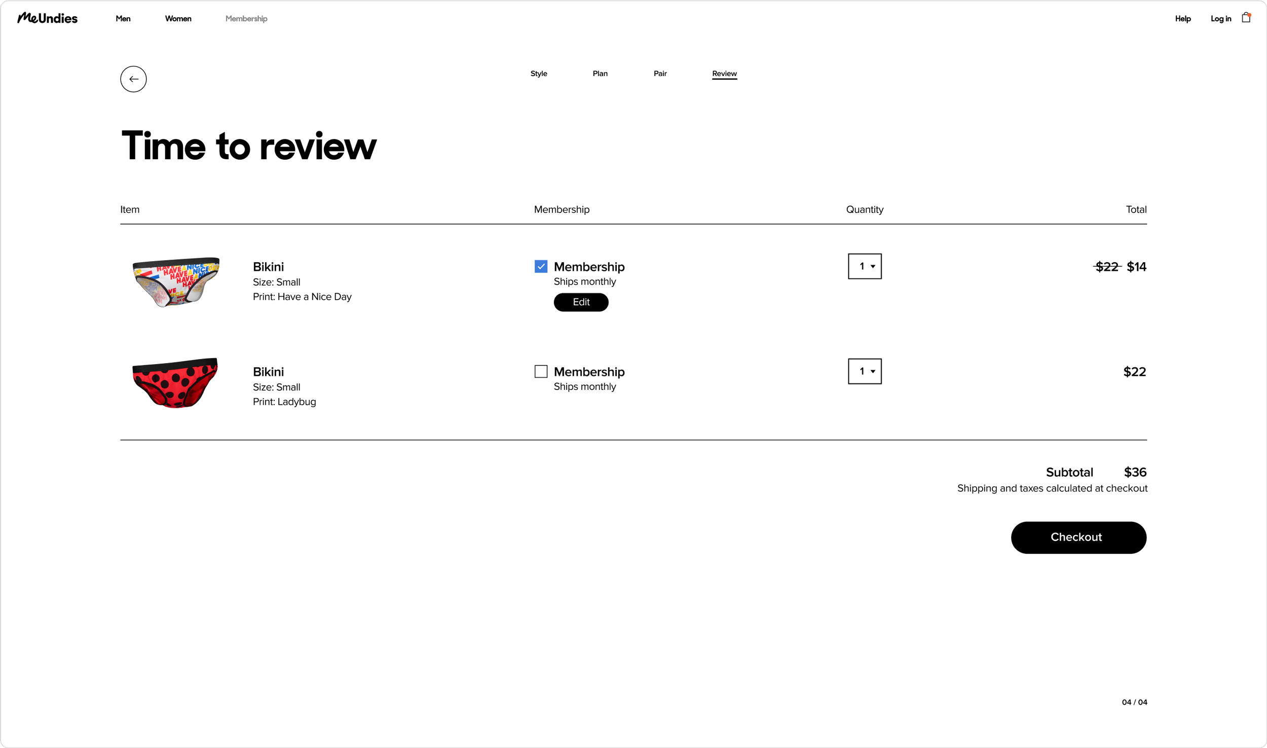
During the design process, I synced with the engineering team for feedback and optimizations to make sure features were within scope. From there, I built two working, fully functioning prototypes in Principle app for both desktop and mobile. Using Lookback, we invited MeUndies customers and people unfamiliar with the brand for user testing then optimized the flow, language, and experience based on their feedback.
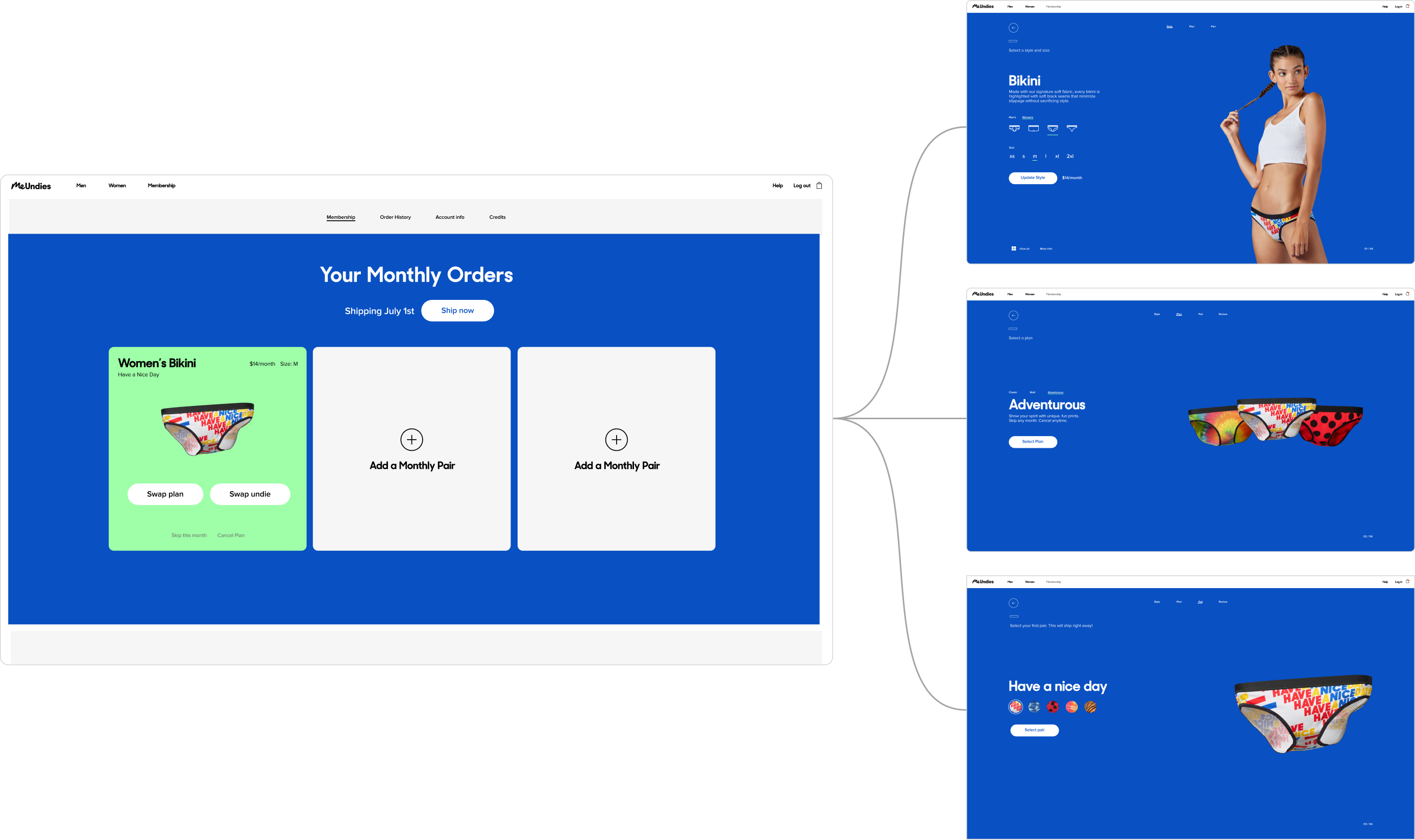
The final step in completing the membership experience was building a logged-in experience for existing members to edit and customize their shipments. Our MVP, would reuse stages of the onboarding flow in order to edit and update plans.
Smells like team spirit
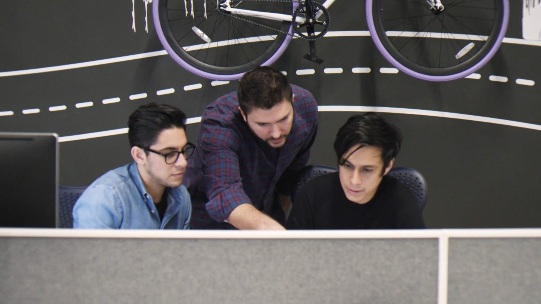
The final step to membership completion was probably the most important and ironically required my least involvement. It meant migrating all Design of the Month subscribers to the new daily shipping algorithm and hoping it didn’t break. Though there wasn’t much I could do from an engineering standpoint, it was still exciting seeing the internal algorithms, learning about the new backend structure, and supporting the team through late nights. And luckily after a couple testing hiccups, things launched without a hitch!
The end is just
the beginning
With the new membership plan launched, our team was able to take a short breather to gather feedback and analyze data before making any optimizations. Overall, the launch coupled with our rebrand was a resounding success with overall positive sentiment from customers, press, and internal teams.
112%
increase in new members over the upcoming year
52%
membership completion rate first month into launch
11 point NPS increase
finishing up the year
Though this huge undertaking was completed under a very tight deadline and the scrappiest of requirements, to this day it is one of the most memorable projects I have ever worked on. It helped solidify MeUndies as a company that could venture into the future as a contender in a very disruptive space and I’m proud to have played a role in that journey.
None of this however could have been done without a very dedicated and cross-functional team sacrificing much of their time and efforts to ensure success.
A special thank you to everyone involved in this project but especially those that put in those extra late hours full of delirious moments.
Creative
Andrew Teague
Eugene Seo
Tyler King
Marie Nahon
Kelly Reilly
Oscar Zaldana
Bob Wolfey
Product
Jimmy Chu
Justin Lalezarian
Sung Noh
Operations
Vicky Tatar
Lia Montgomery
Tori Coyne
Zach Rosner
Bethley Matsubara
Leadership
Jonathan Shokrian
Dan King
Greg Fass
Jason Worrel

Johan Vilchez
Los Angeles CA
Copyright 2023